Normally, the NBA playoffs would be nearing their apogee as teams slugged it out in their respective Conference Finals. Instead over the last month, the basketball world strapped themselves in every Sunday night to receive Michael Jordan propaganda.
Well, today we are gathering here to opine and reminisce about the 1990s too. Specifically the attire of the Western Conference’s best teams. Yes, you read correctly. Your wildest dreams have come true as I give my unqualified opinion concerning NBA jerseys.
And in true suspenseful fashion we’ll do this in countdown mode from the best jerseys to the worst. Here’s how it’s gonna work.
Each team in the respective series will be given a grade from 0 (worst) to 10 (best) on their jerseys and the two clubs will then have their jersey scores combined to reach their full score. Not that complicated, so…
Let’s get started!
#10 — 1999 Portland Trail Blazers vs. San Antonio Spurs
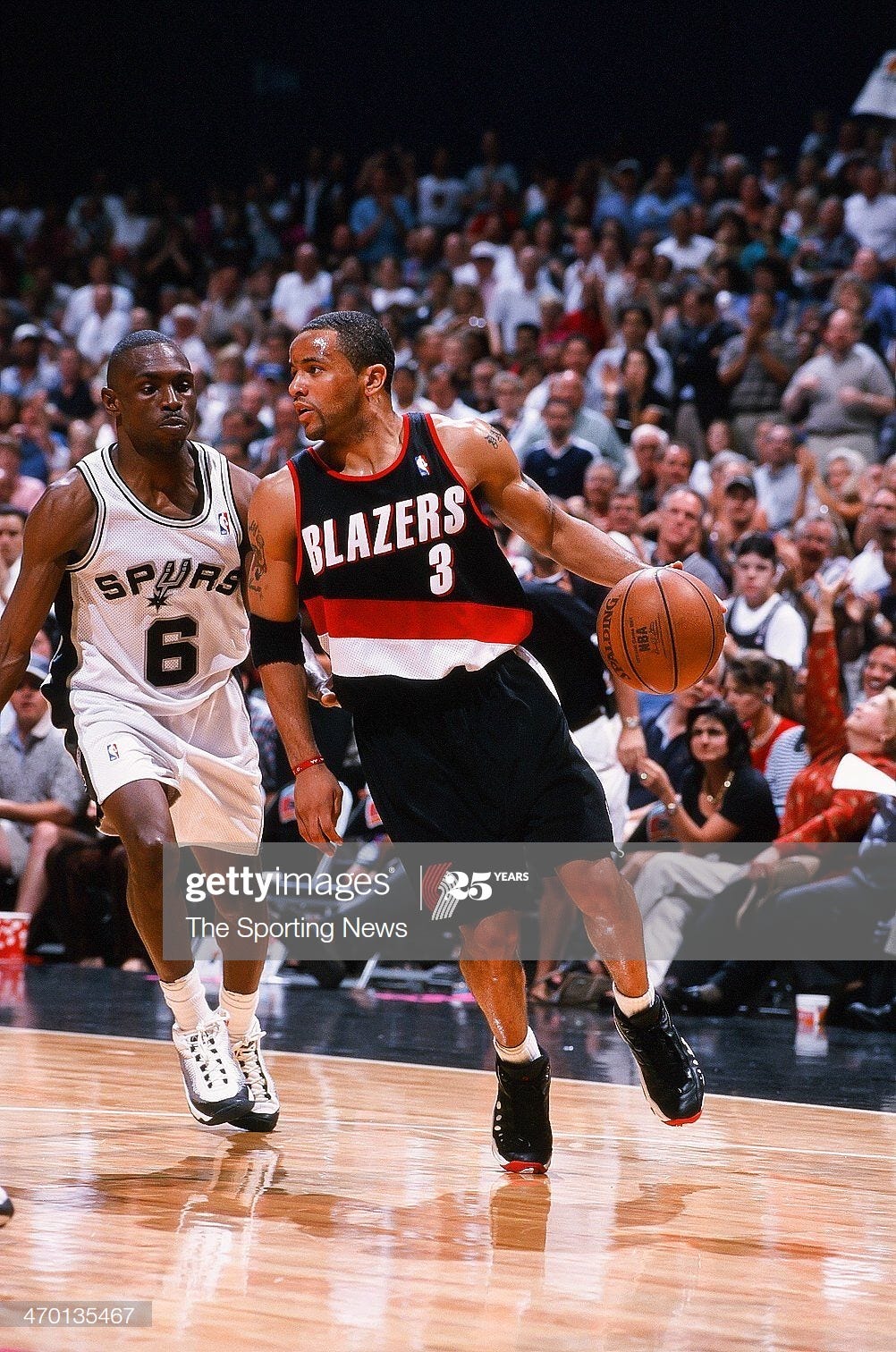
Blazers score: 9.5
Spurs score: 9.5
Total: 19
Each franchise has absolutely stunning jerseys that have basically stood the test of the time. They make slight alterations here and there, but San Antonio and Portland each have basically had the same look for over 40 years.
I personally enjoy these 1999 threads from each club so much because they provide a very clean feel. The lettering is large but not too big. It could easily have been too blocky, but the addition by each team of some shadow work makes the lettering come across as bold and stark.
And the colors also mesh well together. Awesome jerseys on their own and they flow well together. That’ll get you the top spot.
#9 — 1995 Houston Rockets vs. San Antonio Spurs
Rockets score: 9
Spurs score: 9.5
Total: 18.5
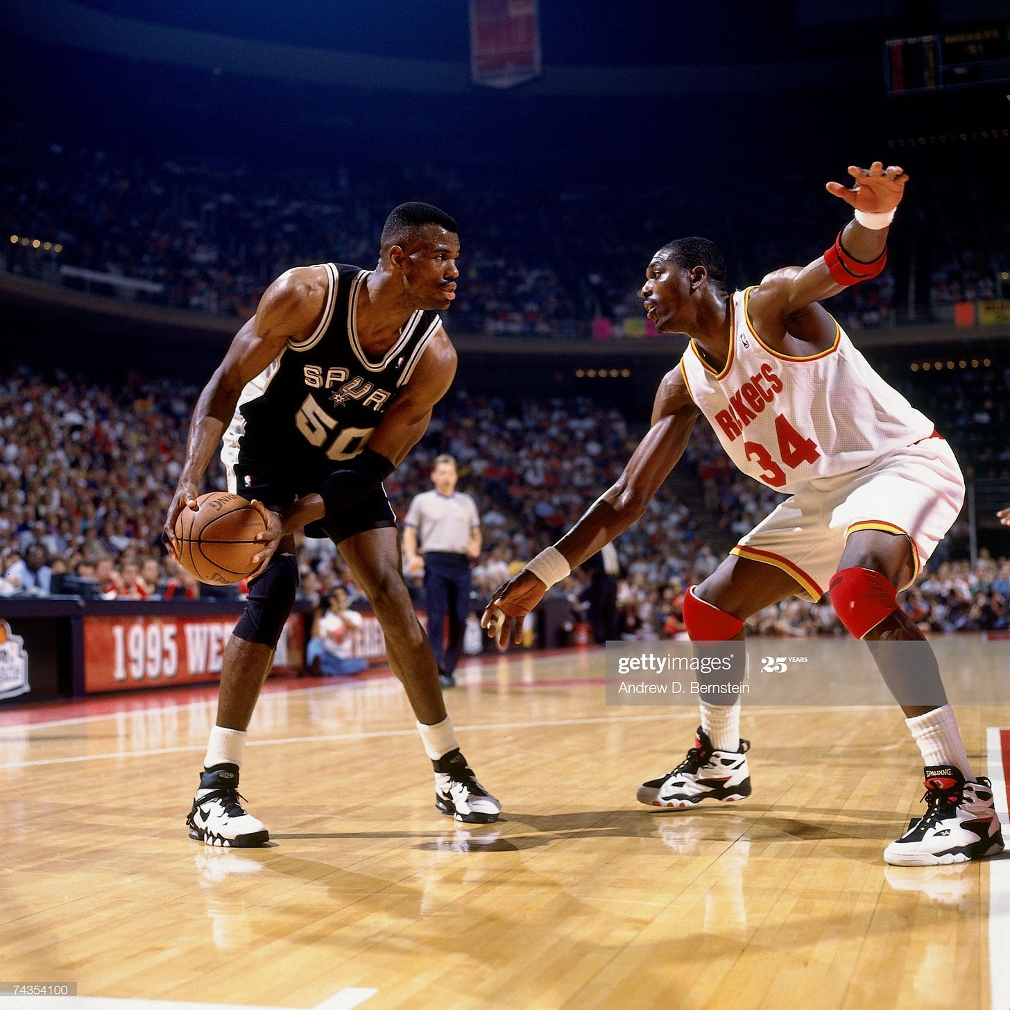
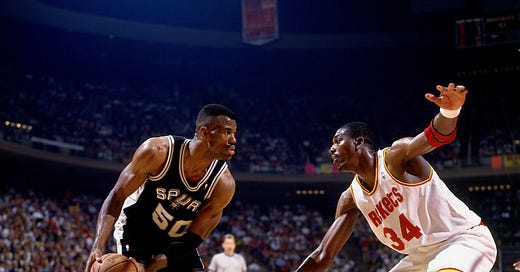
The Spurs’ run of jersey excellence was unabated in 1995 even if the squad was smoked by Hakeem Olajuwon in the Interstate-10 battle. However, I do have to admit San Antonio’s jerseys were slightly better than Houston’s. The Rockets’ truly are one of the best jerseys in NBA history. A profile in splendid simplicity with a dominating color (white for home, red for road) that was augmented by touches of supplementary yellow and white/red. It’s just that the Spurs having an actual spur as the “U” in their lettering, which is hard to beat.
#8 — 1993 Seattle SuperSonics vs. Phoenix Suns
Sonics score: 10
Suns score: 8
Total: 18
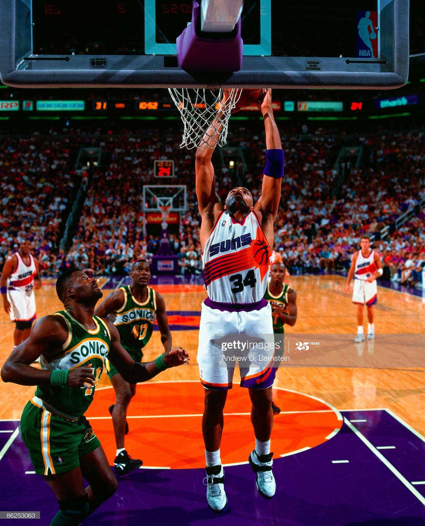
These SuperSonics jerseys are the best in NBA history. At least in my opinion. And that’s how these rankings are determined—my unqualified opinion—so Seattle gets a perfect 10. The colors are great, they’re employed in the right proportions, the rainbow curve of “Sonics” set against a white backdrop, and the logo (also a perfect 10) being on the trunks is dynamite.
So the reason this isn’t the best Conference Finals jersey matchup is because of Phoenix. Don’t get me wrong, their jerseys aren’t bad. In fact, I think they’re very good. It’s just that they’re a little too 1990s and not a style for all seasons. It’s definitely the cartoonish basketball Sun streaking across the chest that does it. Anyways, the Suns would later unveil a black alternate that—streaking sun or not—are one of THE BEST NBA jerseys. But they didn’t have it for this series.
#7 — 1992 Utah Jazz vs. Portland Trail Blazers
Jazz score: 8
Blazers score: 9.5
Total: 17.5
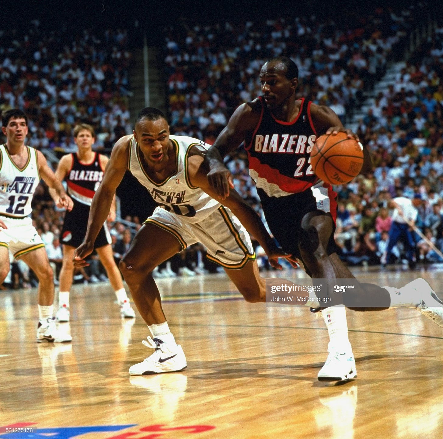
The Blazers are back and nothing to add to what I mentioned earlier.
The Utah Jazz jerseys meanwhile are also in the realm of very good classics. I never did like the mid-1980s changes they made to the jersey, though. Subtle changes, but they took their toll. First, “Utah” was squished in above “Jazz.” I always thought they looked better with just “Jazz” on the chest. Second, they ditched the green road uniforms for the purples. The greens were definitely better. But mere quibbles, these changes, especially since the whites were so good.
#6 — 1994 Utah Jazz vs. Houston Rockets
Jazz score: 8
Rockets score: 9
Total: 17
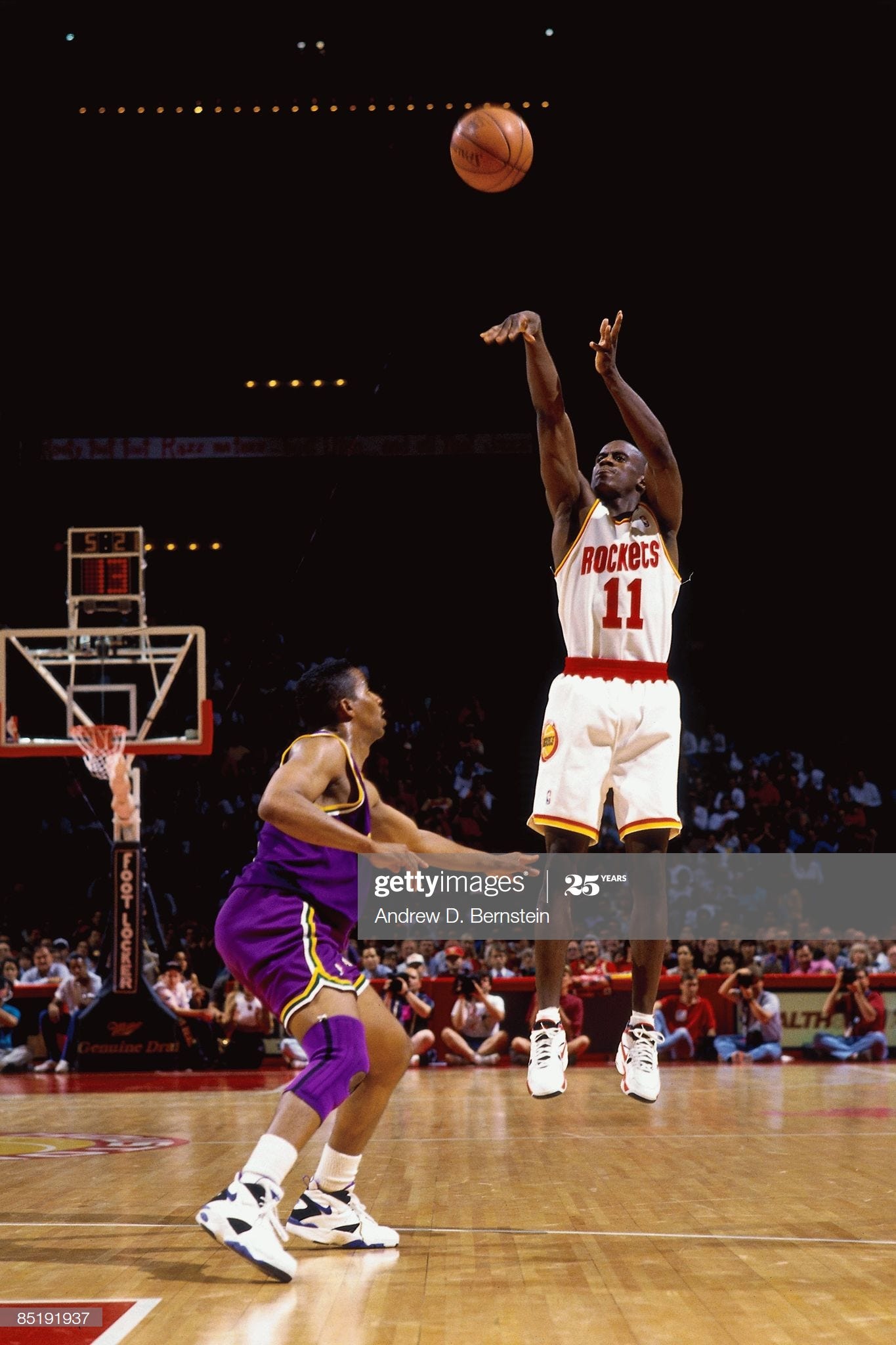
Damn those Rockets jerseys look sweet. Especially with Vernon Maxwell firing away over the alright purple Jazz uniforms. One thing I will say is that these jerseys didn’t mesh well together like the Spurs-Blazers or even Sonics-Suns. Anyways on to the next matchup, since y’all know my feelings on these two jerseys already.
#5 — 1991 Los Angeles Lakers vs. Portland Trail Blazers
Lakers score: 8.5
Blazers score: 8
Total: 16.5
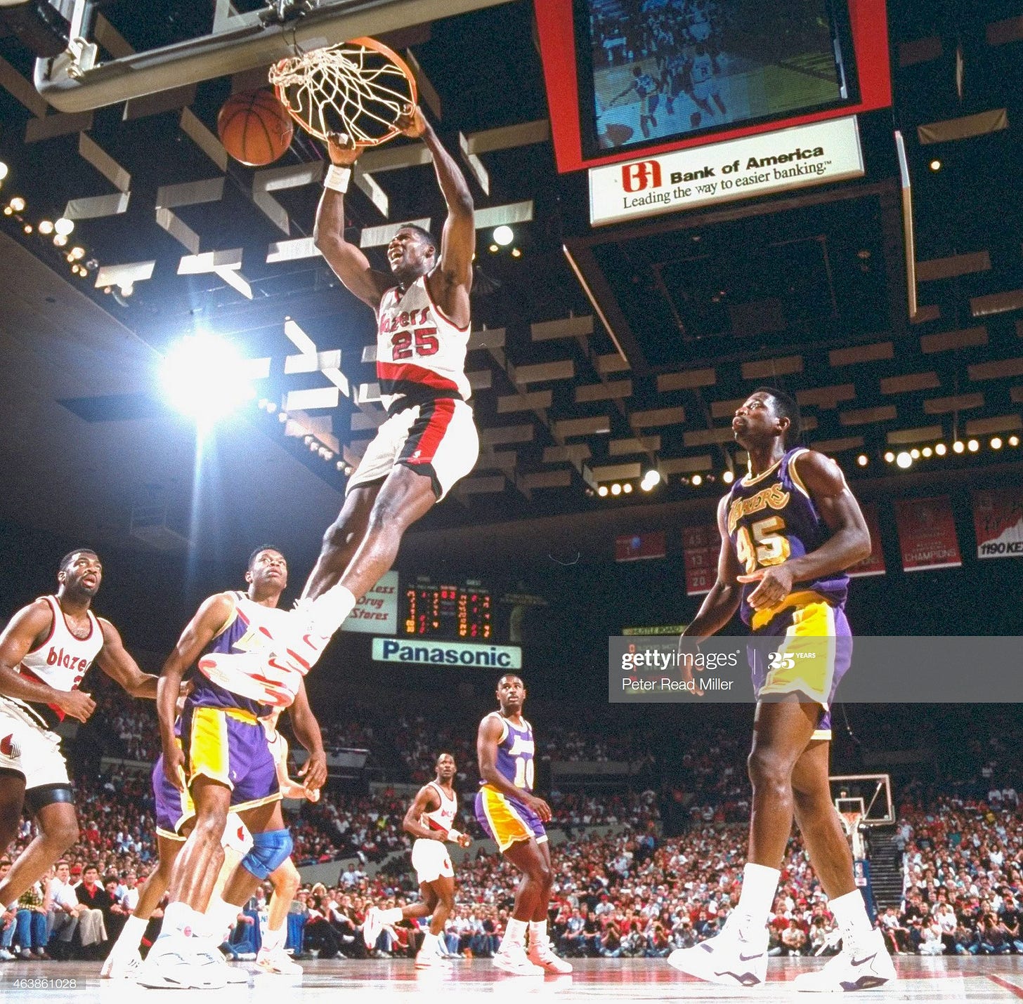
First off, the Blazers jerseys are slightly different than the ones we’ve looked at already. The main point of contention for me is the lettering. “Blazers” is spelled out in some weird ass font that looks a digital alarm clock from the 1980s. It certainly doesn’t ruin the jersey, but it knocks it down a peg from the mid-and-late 90s iterations.
Second, I do enjoy the Showtime Lakers jerseys. Especially how they’ve always had the numbers shadowed. And the weirdest part about these jerseys, they look so much better with the short shorts. As NBA trunks got longer in the 90s, the look was still good, but just wasn’t the same. So, I was glad when the Lakers did an update in 2000 giving us the three-peat look that kept the Showtime essence, but provided a new millennium sheen. But that’s for another article.
#4 — 1990 Phoenix Suns vs. Portland Trail Blazers
Suns score: 7.5
Blazers score: 8
Total: 15.5
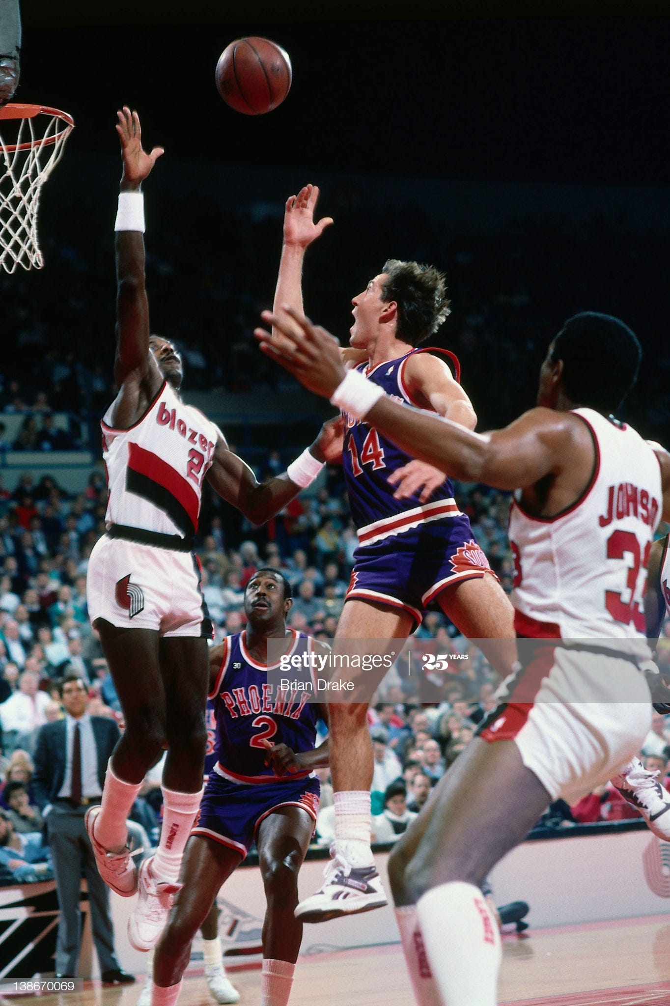
The slightly weird 1980s Blazers jerseys strike again. Meanwhile, I like the Suns’ jerseys which were holdovers from the 1970s and 1980s as well. But I don’t love them. I just think they belong in an old west saloon, not a basketball court. The jerseys do contrast well together though, so that’s a good thing.
#3 — 1996 Utah Jazz vs. Seattle SuperSonics
Jazz score: 8
Sonics score: 5
Total: 13.5
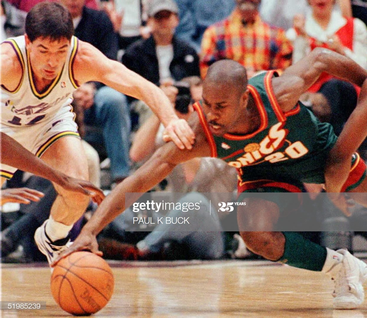
Our first disappointing jersey clash. Which is pretty good when we’re this far down the list. The Jazz were still operating in their classic uniforms, so the culprits here were the Sonics inexplicably going from a perfect jersey to an average jersey. I am very angry that the last time Seattle made the NBA Finals, they did so in these dorky Space Needle threads. They certainly aren’t the worst look that the slew of 1990s redesigns had to offer (we’re about to get to those), but it’s just so painful given what tossed aside for these meh jerseys. I don’t even think that rusty orange-brown color has been seen on clothing since 1999.
Anyways, onward and downward…
#2 — 1998 Los Angeles Lakers vs. Utah Jazz
Lakers score: 8.5
Jazz score: 2
Total: 10.5
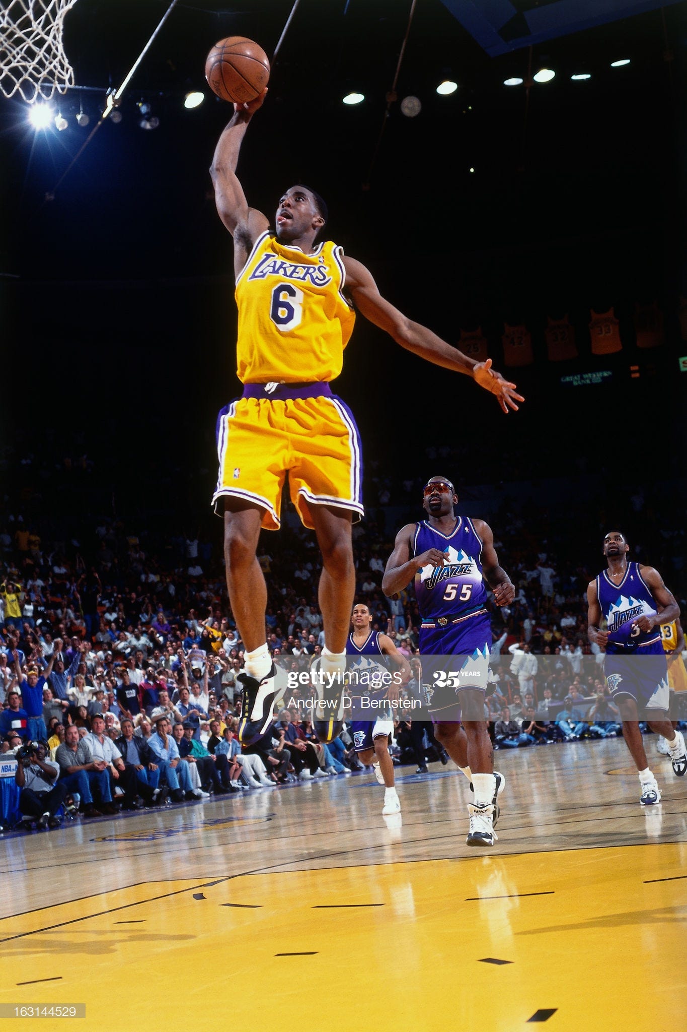
The Jazz won the series, but the Lakers win the war as they still had their classic Showtime look.
These mountain range Jazz jerseys are one of the absolute worst jerseys in basketball history. How you gonna be named “Jazz” and then ditch the perfect logo of a music note “J” in favor of a mountain range? To boot, they came up with that ugly color scheme. Y’all already know I liked the green more than purple, now they removed green from the scheme entirely.
*annoyed grunt*
Oh well, I probably would be more pissed if they did keep the old color scheme and paired it with the mountain look. Overall just one of the worst decisions in NBA style. Yet somehow, there was one worse…
#1 — 1997 Houston Rockets vs. Utah Jazz
Rockets score: 1
Jazz score: 2
Total: 3
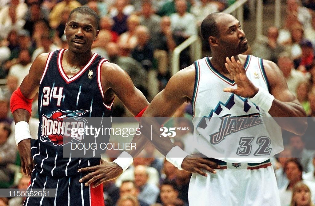
The bottom of the barrel is brought to you by the Jazz and the f%#king dreadful Houston Rockets. Hakeem and Karl Malone don’t even want to be seen in these ugly things.
Houston’s jerseys were the worst of the 90s brought to bear. First, there’s the absurd cartoonish logo. Y’know, at least the Suns’ sun actually looked somewhat like a real star. What’s up with this shark-looking space ship for Houston? And it’s flying around a basketball. What in the fresh hell?
Second, the hilariously sad attempt at pinstripes. The Charlotte Hornets and Orlando Magic set off this trend and other teams tried to copy it to varying degrees of success (Indiana and Chicago did well). Houston failed terribly at it. The stripes look like futuristic prison bars.
Third, like the Sonics but on a much worse level, Houston threw away a beautiful jersey for the chance to look like trash. Win back-to-back titles and then change the logo and jersey? No wonder Houston hasn’t been back to an NBA Finals since. It’s the curse of the ketchup-and-mustard jerseys. The Rockets shall never win a title again until they come home to the condiment colors.


The Blazers' uniforms shown in the 1990 and 1991 Western Conference Finals are truly treasured among Blazers' fans of the team since the late 1970's. To us they are not "weird ass." They represent the post-1977 championship teams which always teased us with greatness, but could not deliver until the arrival of Clyde, Jerome, TP, Buck, and Duck in the mid-to-late 80's. The change in the 1991-92 season to those uniforms seen in the 1992 and 1999 WCF was well received, but I would trade in a heartbeat the Nike created wreck of NBA uniforms to have those sweet threads back. Rip City!
Defending tacky 90s jerseys is a (Grant) hill I'm happy to die on. Teams stopped taking themselves so freaking seriously, and I love it. There's nothing wrong with a goofy rockets cartoon or some ridiculous mountains in my book!